Overview
Using functions that automatically apply a set of formatting options to plots and tables saves time, allowing us to focus on the analysis and interpretation. Code will also look much cleaner when those ~10 repeated lines of ggplot for each plot are automated away. Importantly, these functions also ensure a polished and consistent appearance across our team, so that outputs look the same irrespective of who generated it.
All theming functions host a variety of other options that can further tweak the overall look of plots and tables (including colours).
The Kids Colours
Colours, consistent with “The Kids” brand guidelines, can be accessed
directly via thekids_colours list:
Colour |
Primary |
50% |
10% |
|---|---|---|---|
Saffron |
saffron |
saffron_50 |
saffron_10 |
Pumpkin |
pumpkin |
pumpkin_50 |
pumpkin_10 |
Teal |
teal |
teal_50 |
teal_10 |
DarkTeal |
darkteal |
darkteal_50 |
darkteal_10 |
CelestialBlue |
celestialblue |
celestialblue_50 |
celestialblue_10 |
AzureBlue |
azureblue |
azureblue_50 |
azureblue_10 |
MidnightBlue |
midnightblue |
midnightblue_50 |
midnightblue_10 |
CoolGrey |
coolgrey |
coolgrey_50 |
coolgrey_10 |
The colours can be visualised with the
thekids_showpalette() function, i.e.
Example Usage
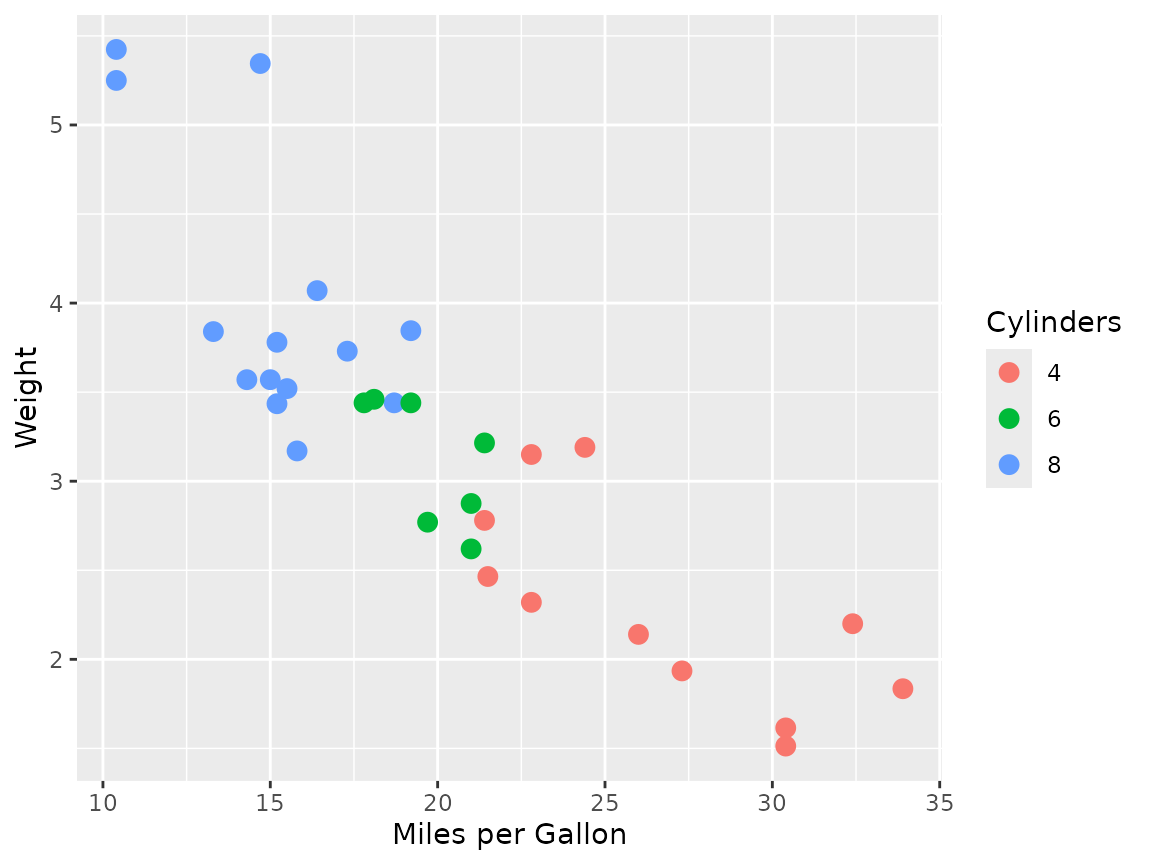
> The Kids theming functions
The thekids_theme, scale_colour_thekids and
scale_fill_thekids functions are useful to apply consistent
theming to ggplot2 visualisations. These use a clean,
minimal aesthetic with fonts that align with “The Kids” branding. Here’s
an example of a plot before-and-after theming:
ggplot(mtcars, aes(x = mpg, y = wt, colour = factor(cyl))) +
  geom_point(size = 3) +
  labs(x = "Miles per Gallon", y = "Weight", colour = "Cylinders")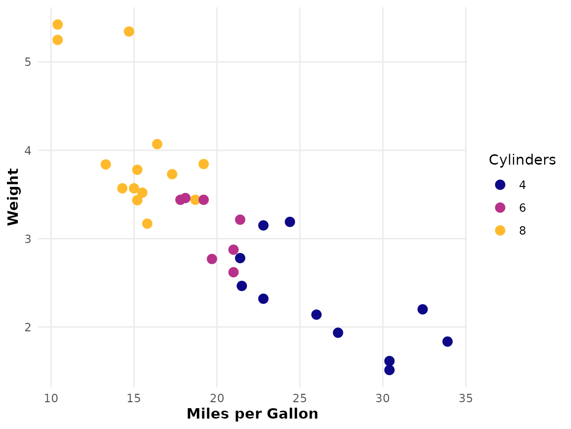
ggplot(mtcars, aes(x = mpg, y = wt, colour = factor(cyl))) +
  geom_point(size = 3) +
  labs(x = "Miles per Gallon", y = "Weight", colour = "Cylinders") +
  thekids_theme() +
  scale_colour_thekids()
Miles better! And as simple as just adding these lines of
code: thekids_theme() + scale_colour_thekids().
> thekids_table
thekids_table produces tables styled with The Kids
branding and is powered by the flextable
package. By default, this function applies the Barlow font, compact
formatting (our preference!), and zebra-striping for readability. Note
that these can all be altered/disabled via parameters (see
?thekids_table documentation).
For example, a raw table output from the mtcars dataset looks like this:
head(mtcars, 5)
#>                    mpg cyl disp  hp drat    wt  qsec vs am gear carb
#> Mazda RX4         21.0   6  160 110 3.90 2.620 16.46  0  1    4    4
#> Mazda RX4 Wag     21.0   6  160 110 3.90 2.875 17.02  0  1    4    4
#> Datsun 710        22.8   4  108  93 3.85 2.320 18.61  1  1    4    1
#> Hornet 4 Drive    21.4   6  258 110 3.08 3.215 19.44  1  0    3    1
#> Hornet Sportabout 18.7   8  360 175 3.15 3.440 17.02  0  0    3    2
Now, applying thekids_table transforms it into a clean,
visually appealing format with branded elements:
head(mtcars, 5) %>%
  thekids_table(colour = "saffron", fontsize = 10)
#> Warning in check_font_family(font_family = font_family, fallback_family =
#> fallback_font_family): Font 'Barlow' not found; falling back to 'sans'.
mpg |
cyl |
disp |
hp |
drat |
wt |
qsec |
vs |
am |
gear |
carb |
|---|---|---|---|---|---|---|---|---|---|---|
21.0 |
6 |
160 |
110 |
3.90 |
2.620 |
16.46 |
0 |
1 |
4 |
4 |
21.0 |
6 |
160 |
110 |
3.90 |
2.875 |
17.02 |
0 |
1 |
4 |
4 |
22.8 |
4 |
108 |
93 |
3.85 |
2.320 |
18.61 |
1 |
1 |
4 |
1 |
21.4 |
6 |
258 |
110 |
3.08 |
3.215 |
19.44 |
1 |
0 |
3 |
1 |
18.7 |
8 |
360 |
175 |
3.15 |
3.440 |
17.02 |
0 |
0 |
3 |
2 |
Table Highlighting
The highlight and zebra arguments are
useful for highlighting rows within a table.
> highlight
Set the specific rows to highlight by passing a vector of indices to
highlight:
head(mtcars, 6) %>%
  thekids_table(colour = "saffron", highlight = c(2, 5))
#> Warning in check_font_family(font_family = font_family, fallback_family =
#> fallback_font_family): Font 'Barlow' not found; falling back to 'sans'.
mpg |
cyl |
disp |
hp |
drat |
wt |
qsec |
vs |
am |
gear |
carb |
|---|---|---|---|---|---|---|---|---|---|---|
21.0 |
6 |
160 |
110 |
3.90 |
2.620 |
16.46 |
0 |
1 |
4 |
4 |
21.0 |
6 |
160 |
110 |
3.90 |
2.875 |
17.02 |
0 |
1 |
4 |
4 |
22.8 |
4 |
108 |
93 |
3.85 |
2.320 |
18.61 |
1 |
1 |
4 |
1 |
21.4 |
6 |
258 |
110 |
3.08 |
3.215 |
19.44 |
1 |
0 |
3 |
1 |
18.7 |
8 |
360 |
175 |
3.15 |
3.440 |
17.02 |
0 |
0 |
3 |
2 |
18.1 |
6 |
225 |
105 |
2.76 |
3.460 |
20.22 |
1 |
0 |
3 |
1 |
By default, the colour used for highlighting is defined as a 50%
lighter tinted version of the colour given to the header. This can be
changed by providing a named colour (including any The Kids colours) or
hex code to the highlight_colour argument.
head(mtcars, 6) %>%
  thekids_table(
    colour = "teal",
    highlight = c(2, 5), highlight_colour = 'lightblue'
  )
#> Warning in check_font_family(font_family = font_family, fallback_family =
#> fallback_font_family): Font 'Barlow' not found; falling back to 'sans'.
mpg |
cyl |
disp |
hp |
drat |
wt |
qsec |
vs |
am |
gear |
carb |
|---|---|---|---|---|---|---|---|---|---|---|
21.0 |
6 |
160 |
110 |
3.90 |
2.620 |
16.46 |
0 |
1 |
4 |
4 |
21.0 |
6 |
160 |
110 |
3.90 |
2.875 |
17.02 |
0 |
1 |
4 |
4 |
22.8 |
4 |
108 |
93 |
3.85 |
2.320 |
18.61 |
1 |
1 |
4 |
1 |
21.4 |
6 |
258 |
110 |
3.08 |
3.215 |
19.44 |
1 |
0 |
3 |
1 |
18.7 |
8 |
360 |
175 |
3.15 |
3.440 |
17.02 |
0 |
0 |
3 |
2 |
18.1 |
6 |
225 |
105 |
2.76 |
3.460 |
20.22 |
1 |
0 |
3 |
1 |
> zebra
If zebra = TRUE, then every other row will be
highlighted.
head(mtcars, 6) %>%
  thekids_table(
    colour = "azureblue",
    zebra = TRUE
  )
#> Warning in check_font_family(font_family = font_family, fallback_family =
#> fallback_font_family): Font 'Barlow' not found; falling back to 'sans'.
mpg |
cyl |
disp |
hp |
drat |
wt |
qsec |
vs |
am |
gear |
carb |
|---|---|---|---|---|---|---|---|---|---|---|
21.0 |
6 |
160 |
110 |
3.90 |
2.620 |
16.46 |
0 |
1 |
4 |
4 |
21.0 |
6 |
160 |
110 |
3.90 |
2.875 |
17.02 |
0 |
1 |
4 |
4 |
22.8 |
4 |
108 |
93 |
3.85 |
2.320 |
18.61 |
1 |
1 |
4 |
1 |
21.4 |
6 |
258 |
110 |
3.08 |
3.215 |
19.44 |
1 |
0 |
3 |
1 |
18.7 |
8 |
360 |
175 |
3.15 |
3.440 |
17.02 |
0 |
0 |
3 |
2 |
18.1 |
6 |
225 |
105 |
2.76 |
3.460 |
20.22 |
1 |
0 |
3 |
1 |
If instead you want the highlighted rows to alternate in chunks of
two or more rows, then an integer can be supplied to zebra
indicating the row chunk size.
head(mtcars, 6) %>%
  thekids_table(
    colour = "azureblue",
    zebra = 2
  )
#> Warning in check_font_family(font_family = font_family, fallback_family =
#> fallback_font_family): Font 'Barlow' not found; falling back to 'sans'.
mpg |
cyl |
disp |
hp |
drat |
wt |
qsec |
vs |
am |
gear |
carb |
|---|---|---|---|---|---|---|---|---|---|---|
21.0 |
6 |
160 |
110 |
3.90 |
2.620 |
16.46 |
0 |
1 |
4 |
4 |
21.0 |
6 |
160 |
110 |
3.90 |
2.875 |
17.02 |
0 |
1 |
4 |
4 |
22.8 |
4 |
108 |
93 |
3.85 |
2.320 |
18.61 |
1 |
1 |
4 |
1 |
21.4 |
6 |
258 |
110 |
3.08 |
3.215 |
19.44 |
1 |
0 |
3 |
1 |
18.7 |
8 |
360 |
175 |
3.15 |
3.440 |
17.02 |
0 |
0 |
3 |
2 |
18.1 |
6 |
225 |
105 |
2.76 |
3.460 |
20.22 |
1 |
0 |
3 |
1 |
… and if you want to reverse the ordering such that the first rows
initiate the highlighting pattern, a negative sign can be added to the
zebra value. For example, zebra=-1 reverses
the result of zebra=1 (or equivalently
zebra=TRUE)
head(mtcars, 6) %>%
  thekids_table(
    colour = "azureblue",
    zebra = -2
  )
#> Warning in check_font_family(font_family = font_family, fallback_family =
#> fallback_font_family): Font 'Barlow' not found; falling back to 'sans'.
mpg |
cyl |
disp |
hp |
drat |
wt |
qsec |
vs |
am |
gear |
carb |
|---|---|---|---|---|---|---|---|---|---|---|
21.0 |
6 |
160 |
110 |
3.90 |
2.620 |
16.46 |
0 |
1 |
4 |
4 |
21.0 |
6 |
160 |
110 |
3.90 |
2.875 |
17.02 |
0 |
1 |
4 |
4 |
22.8 |
4 |
108 |
93 |
3.85 |
2.320 |
18.61 |
1 |
1 |
4 |
1 |
21.4 |
6 |
258 |
110 |
3.08 |
3.215 |
19.44 |
1 |
0 |
3 |
1 |
18.7 |
8 |
360 |
175 |
3.15 |
3.440 |
17.02 |
0 |
0 |
3 |
2 |
18.1 |
6 |
225 |
105 |
2.76 |
3.460 |
20.22 |
1 |
0 |
3 |
1 |