Code
library(simstudy)
library(ggsankey); library(ggalluvial)
library(likert); library(patchwork)
library(gt); library(gtsummary)
library(flextable)
library(thekidsbiostats) # install with remotes::install_github("The-Kids-Biostats/thekidsbiostats")Likert scale variables (and hence data) are widely utilised in research—they are useful for getting participants to rate things, or to provide an average quantity as a response in situations where asking for the exact quantity may be problematic. How can asking for an exact quantity be problematic? Well, consider the example below that relates to how much water one drinks per day. Very few people drink the exact same amount of water each day, so asking participants “How many (250ml) glasses of water do you drink per day” and getting a response of “3” is typically pointless—there is likely substantial measurement error, and if they drank 3 glasses yesterday (anomaly or otherwise) but 4 glasses the day before, is the response of 3 not just outright incorrect?
What is presented below is nothing ground breaking. We went in search of a concise, succinct, and accurate way to display (specifically) “pre/post” Likert data, and this is where we are currently at.
Firstly, some definitions. There are two main types of Likert data. We are going to refer to them as “ordinal” and “bidirectional”.
Ordinal Likert data (sometimes called unipolar Likert data, or interval Likert data) involves category responses that have some natural order (decreasing/increasing) to them, the width of categories and the distance between categories are not necessarily consistent, and the categories often represent a underlying continuous scale that has been ‘binned’ (into the Likert categories).
An example. “How many glasses of water do you typically drink per day?” with response options:
Birectional Likert data (sometimes called bipolar Likert data) involves category responses that have a natural order with responses from two opposing directions—typically negative responses and positive responses—around a central (or neutral) point.
An example. “The amount of reading I do influences how much reading my child does?” with response options:
We’ll return to bidirectional Likert data in a future post, for now we will look at ordinal Likert data.
library(simstudy)
library(ggsankey); library(ggalluvial)
library(likert); library(patchwork)
library(gt); library(gtsummary)
library(flextable)
library(thekidsbiostats) # install with remotes::install_github("The-Kids-Biostats/thekidsbiostats")We’re going to use one of our favourite packages to create some synthetic data to use.
Specifically, we will simulate some pre and post response data, a group identifier (intervention or control), and then some labelled response columns.
set.seed(123) # For reproducibility

# dat_i is the intervention group
n <- 183 # Set the number of individuals
def <- defData(varname = "pre", formula = "1;5", dist = "uniformInt") # Pre values: uniformly distributed between 1 and 5
dat_i <- genData(n, def)
group_probs <- c(0.45, 0.45, 0.10)
dat_i$grp <- sample(1:3, n, replace = TRUE, prob = group_probs)
dat_i$post <- dat_i$pre

dat_i$post[dat_i$grp == 2] <- pmin(dat_i$pre[dat_i$grp == 2] + (rbinom(sum(dat_i$grp == 2), 2, 0.2) + 1), 5) # Increase by 1, max 5
dat_i$post[dat_i$grp == 3] <- pmax(dat_i$pre[dat_i$grp == 3] - (rbinom(sum(dat_i$grp == 3), 2, 0.2) + 1), 1) # Decrease by 1, min 1

# dat_c is the control group
n <- 154 # Set the number of individuals
def <- defData(varname = "pre", formula = "1;5", dist = "uniformInt") # Pre values: uniformly distributed between 1 and 5
dat_c <- genData(n, def)
group_probs <- c(0.55, 0.25, 0.20)
dat_c$grp <- sample(1:3, n, replace = TRUE, prob = group_probs)
dat_c$post <- dat_c$pre

dat_c$post[dat_c$grp == 2] <- pmin(dat_c$pre[dat_c$grp == 2] + (rbinom(sum(dat_c$grp == 2), 2, 0.2) + 1), 5) # Increase by 1, max 5
dat_c$post[dat_c$grp == 3] <- pmax(dat_c$pre[dat_c$grp == 3] - (rbinom(sum(dat_c$grp == 3), 2, 0.2) + 1), 1) # Decrease by 1, min 1

# Combine the control & intervention data into one dataframe
dat <- rbind(cbind(dat_i, group = "Intervention"),
             cbind(dat_c, group = "Control")) %>%
  mutate(post = as.integer(post)) %>%
  select(-grp)

# Add some factored labels
dat <- dat %>%
  mutate(pre_l = fct_case_when(pre == 1 ~ "Less than one cup/day",
                               pre == 2 ~ "About 1-2 cups/day",
                               pre == 3 ~ "About 3-4 cups/day",
                               pre == 4 ~ "About 5-6 cups/day",
                               pre == 5 ~ "More than 6 cups/day"),
         post_l = fct_case_when(post == 1 ~ "Less than one cup/day",
                                post == 2 ~ "About 1-2 cups/day",
                                post == 3 ~ "About 3-4 cups/day",
                                post == 4 ~ "About 5-6 cups/day",
                                post == 5 ~ "More than 6 cups/day"))

# Visualise the first few rows of data
head(dat, 5) %>%
  thekids_table(colour = "Saffron", padding = 3)
id | pre | post | group | pre_l | post_l |
|---|---|---|---|---|---|
1 | 2 | 3 | Intervention | About 1-2 cups/day | About 3-4 cups/day |
2 | 4 | 4 | Intervention | About 5-6 cups/day | About 5-6 cups/day |
3 | 3 | 3 | Intervention | About 3-4 cups/day | About 3-4 cups/day |
4 | 5 | 5 | Intervention | More than 6 cups/day | More than 6 cups/day |
5 | 5 | 5 | Intervention | More than 6 cups/day | More than 6 cups/day |
max_prop <- dat %>%
  select(id, group, pre, post) %>%
  pivot_longer(cols = c(pre, post)) %>%
  group_by(group, name) %>%
  count(value) %>%
  mutate(freq = n / sum(n)) %>%
  .$freq %>%
  max

max_prop <- plyr::round_any(max_prop, 0.05, f = ceiling)

p1 <- dat %>%
  filter(group == "Intervention") %>%
  group_by(pre) %>%
  tally() %>%
  mutate(freq = n / sum(n),
         res = str_c(n, "\n(", round(freq*100, 1), "%)")) %>%
  ggplot(aes(x = as.factor(pre), y = freq)) +
  geom_bar(aes(fill = as.factor(pre)), stat="identity", alpha = 0.8,
           colour = "black") +
  theme_institute(base_size = 14) +
  theme(legend.position = "none",
        panel.grid.major.x = element_blank(),
        plot.title = element_text(hjust = 0.5)) +
  scale_y_continuous(labels = scales::percent_format(),
                     breaks = seq(0, max_prop, by = 0.05),
                     expand = expansion(mult = c(0, 0.1))) +
  coord_cartesian(ylim = c(0, max_prop)) +
  scale_fill_viridis_d(option = "plasma", end = 0.85, direction = -1) +
  labs(title = "Pre",
       fill = "Response",
       x = "Response", y = "") +
  geom_text(aes(label = res), vjust = -0.1,
            family = "Barlow Semi Condensed") +
  guides(fill = guide_legend(nrow = 1))


p2 <- dat %>%
  filter(group == "Intervention") %>%
  rename(Pre = pre,
         Post = post) %>%
  make_long(Pre, Post) %>%
  mutate(node = factor(node, levels = c(7,6,5,4,3,2,1)),
         next_node = factor(next_node, levels = c(7,6,5,4,3,2,1))) %>%
  ggplot(aes(x = x,
             next_x = next_x,
             node = node,
             next_node = next_node,
             fill = factor(node))) +
  geom_sankey(alpha = 0.7,
              node.color = 'black') +
  geom_sankey_label(aes(label = node), alpha = 0.75,
                    size = 3, color = "black", fill = "gray80") +
  scale_x_discrete(expand = c(0.05,0.05)) +
  theme_institute(base_size = 14) +
  theme(panel.grid.major = element_blank(),
        panel.grid.minor = element_blank(),
        axis.title.y=element_blank(),
        axis.text.y=element_blank(),
        axis.ticks=element_blank(),
        legend.position = "bottom",
        plot.title = element_text(hjust = 0.5)) +
  guides(fill = guide_legend(reverse = T, nrow = 1)) +
  labs(title = "Pre-post",
       fill = "Response",
       x = "")

p3 <- dat %>%
  filter(group == "Intervention") %>%
  group_by(post) %>%
  tally() %>%
  mutate(freq = n / sum(n),
         res = str_c(n, "\n(", round(freq*100, 1), "%)")) %>%
  ggplot(aes(x = as.factor(post), y = freq)) +
  geom_bar(aes(fill = as.factor(post)), stat="identity", alpha = 0.8,
           colour = "black") +
  theme_institute(base_size = 14) +
  theme(legend.position = "none",
        panel.grid.major.x = element_blank(),
        plot.background = element_blank(),
        plot.title = element_text(hjust = 0.5)) +
  scale_y_continuous(labels = scales::percent_format(),
                     breaks = seq(0, max_prop, by = 0.05),
                     expand = expansion(mult = c(0, 0.1))) +
  coord_cartesian(ylim = c(0, max_prop)) +
  scale_fill_viridis_d(option = "plasma", end = 0.85, direction = -1) +
  labs(title = "Post",
       fill = "Response",
       x = "Response", y = "") +
  geom_text(aes(label = res), vjust = -0.1,
            family = "Barlow Semi Condensed") +
  guides(fill = guide_legend(nrow = 1))
We create the plot as three panels, and then use patchwork to control the joining together of the panels into one image.
p1 + p2 + p3 + theme(legend.position = "none")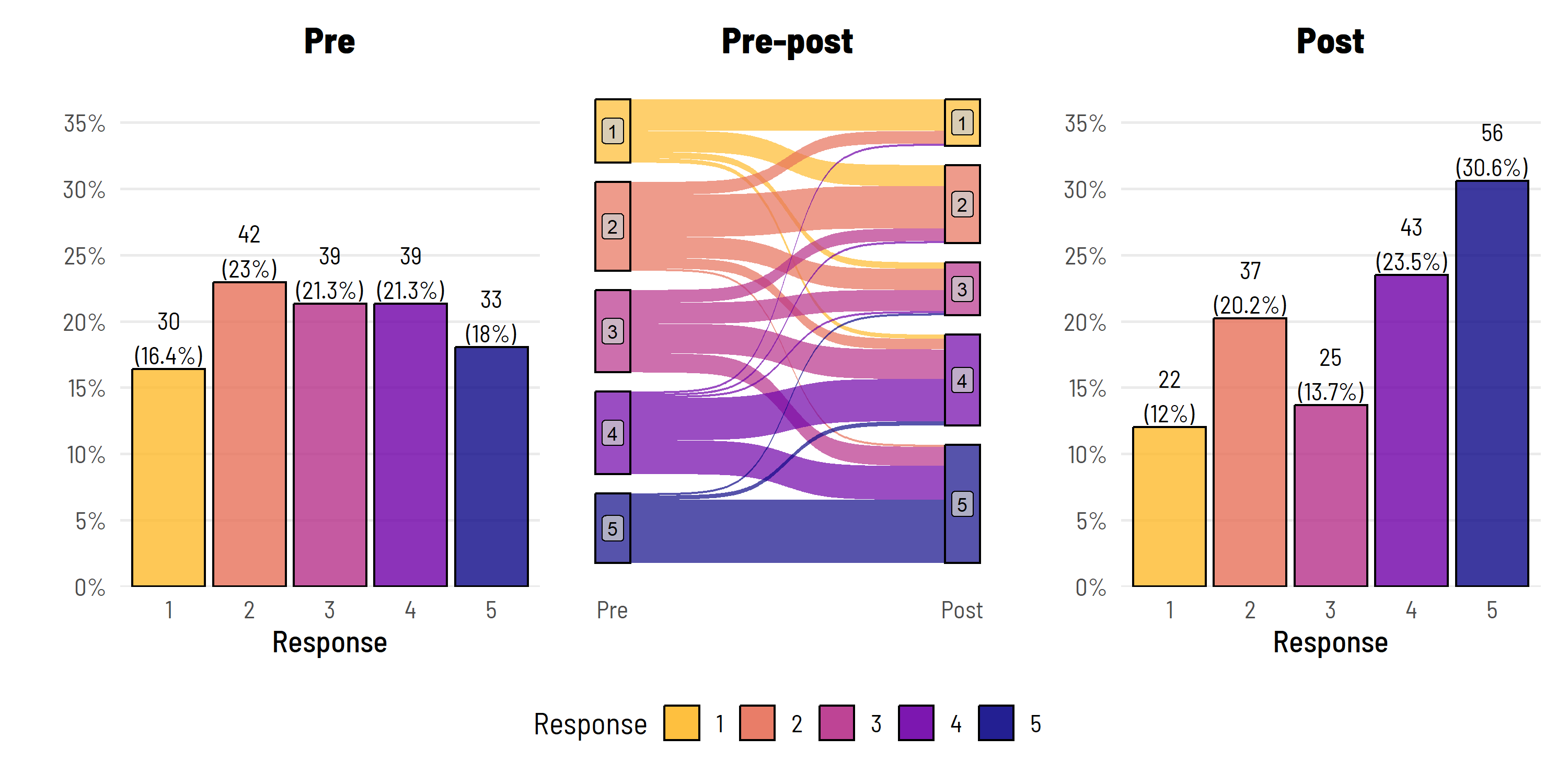
I know what you’re thinking: i) that looks great, ii) slow down, you had two groups.
Correct on both accounts. This is just the intervention group data.
q1 <- dat %>%
  filter(group == "Control") %>%
  group_by(pre) %>%
  tally() %>%
  mutate(freq = n / sum(n),
         res = str_c(n, "\n(", round(freq*100, 1), "%)")) %>%
  ggplot(aes(x = as.factor(pre), y = freq)) +
  geom_bar(aes(fill = as.factor(pre)), stat="identity", alpha = 0.8,
           colour = "black") +
  theme_institute(base_size = 14) +
  theme(legend.position = "none",
        panel.grid.major.x = element_blank(),
        plot.title = element_text(hjust = 0.5)) +
  scale_y_continuous(labels = scales::percent_format(),
                     breaks = seq(0, max_prop, by = 0.05),
                     expand = expansion(mult = c(0, 0.1))) +
  coord_cartesian(ylim = c(0, max_prop)) +
  scale_fill_viridis_d(option = "plasma", end = 0.85, direction = -1) +
  labs(title = "Pre",
       fill = "Response",
       x = "Response", y = "") +
  geom_text(aes(label = res), vjust = -0.1,
            family = "Barlow Semi Condensed") +
  guides(fill = guide_legend(nrow = 1))


q2 <- dat %>%
  filter(group == "Control") %>%
  rename(Pre = pre,
         Post = post) %>%
  make_long(Pre, Post) %>%
  mutate(node = factor(node, levels = c(7,6,5,4,3,2,1)),
         next_node = factor(next_node, levels = c(7,6,5,4,3,2,1))) %>%
  ggplot(aes(x = x,
             next_x = next_x,
             node = node,
             next_node = next_node,
             fill = factor(node))) +
  geom_sankey(alpha = 0.7,
              node.color = 'black') +
  geom_sankey_label(aes(label = node), alpha = 0.75,
                    size = 3, color = "black", fill = "gray80") +
  scale_x_discrete(expand = c(0.05,0.05)) +
  theme_institute(base_size = 14) +
  theme(panel.grid.major = element_blank(),
        panel.grid.minor = element_blank(),
        axis.title.y=element_blank(),
        axis.text.y=element_blank(),
        axis.ticks=element_blank(),
        legend.position = "bottom",
        plot.title = element_text(hjust = 0.5)) +
  guides(fill = guide_legend(reverse = T, nrow = 1)) +
  labs(title = "Pre-post",
       fill = "Response",
       x = "")

q3 <- dat %>%
  filter(group == "Control") %>%
  group_by(post) %>%
  tally() %>%
  mutate(freq = n / sum(n),
         res = str_c(n, "\n(", round(freq*100, 1), "%)")) %>%
  ggplot(aes(x = as.factor(post), y = freq)) +
  geom_bar(aes(fill = as.factor(post)), stat="identity", alpha = 0.8,
           colour = "black") +
  theme_institute(base_size = 14) +
  theme(legend.position = "none",
        panel.grid.major.x = element_blank(),
        plot.background = element_blank(),
        plot.title = element_text(hjust = 0.5)) +
  scale_y_continuous(labels = scales::percent_format(),
                     breaks = seq(0, max_prop, by = 0.05),
                     expand = expansion(mult = c(0, 0.1))) +
  coord_cartesian(ylim = c(0, max_prop)) +
  scale_fill_viridis_d(option = "plasma", end = 0.85, direction = -1) +
  labs(title = "Post",
       fill = "Response",
       x = "Response", y = "") +
  geom_text(aes(label = res), vjust = -0.1,
            family = "Barlow Semi Condensed") +
  guides(fill = guide_legend(nrow = 1))
We can double up the plot, again using patchwork, to show both groups.
patchwork <- (p1 + p2 + p3) / (q1 + q2 + q3)

patchwork +
  plot_annotation(tag_levels = list(c('Intervention', '', '',
                                      'Control', '', ''))) &
  theme(plot.tag.position = c(0, 1),
        plot.tag = element_text(face = "bold", hjust = 0, vjust = 0))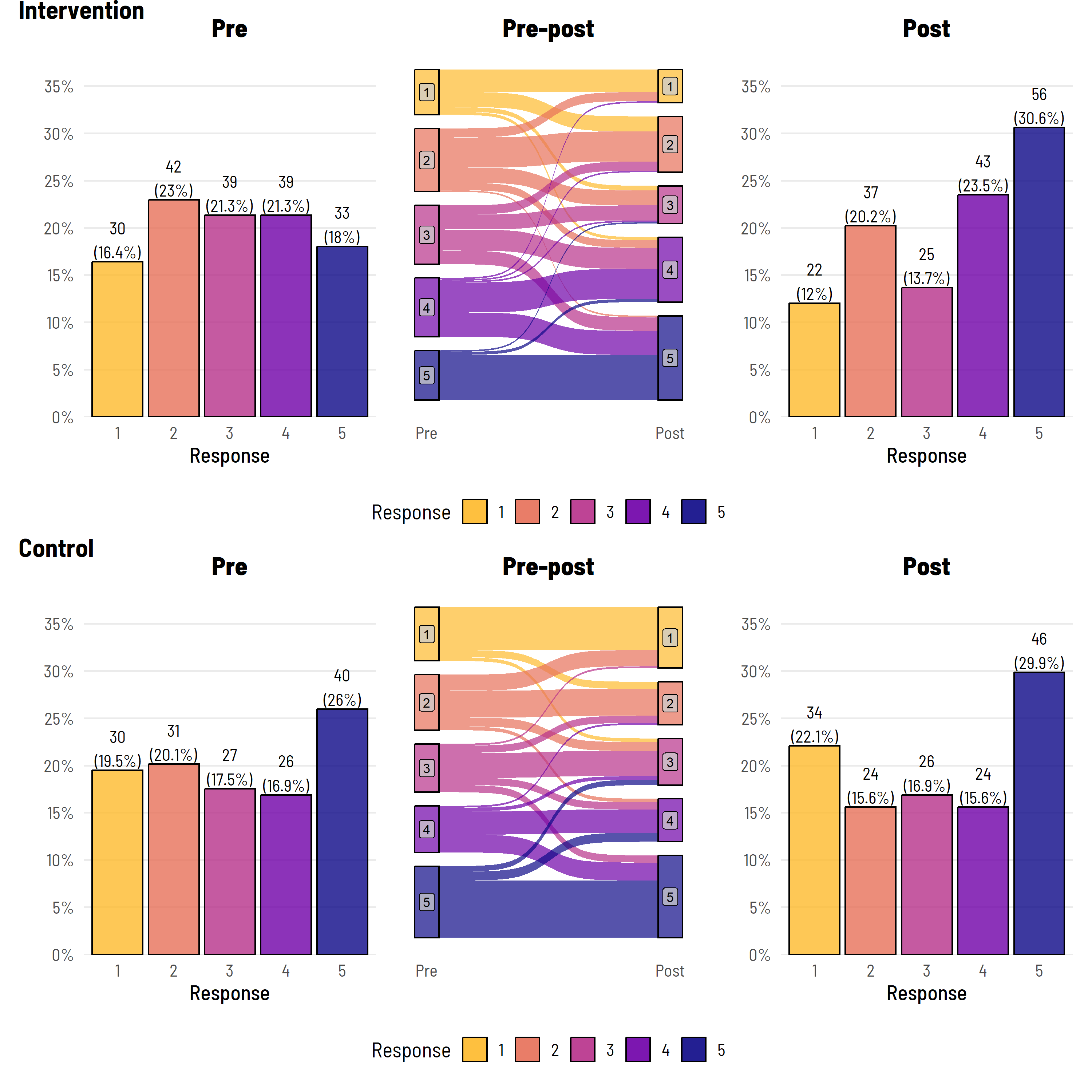
And, we might also like to table some of the ‘change’ data that this plot is based on—using our favourite package (to battle with) gtsummary.
dat %>%
  mutate(Change = fct_case_when(post < pre ~ "Decrease",
                                pre == post ~ "No change",
                                post > pre ~ "Increase")) %>%
  select(group, pre_l, Change) %>%
  tbl_strata(
    strata = group,
    ~.x %>%
      tbl_summary(
        by = pre_l) %>%
      modify_header(all_stat_cols() ~ "**{level}**"),
    .combine_with = "tbl_stack"
  ) %>%
  thekids_table(colour = "Saffron")
Group | Characteristic | Less than one cup/day1 | About 1-2 cups/day1 | About 3-4 cups/day1 | About 5-6 cups/day1 | More than 6 cups/day1 |
|---|---|---|---|---|---|---|
Control | Change | |||||
Decrease | 0 (0%) | 9 (29%) | 5 (19%) | 3 (12%) | 8 (20%) | |
No change | 24 (80%) | 15 (48%) | 14 (52%) | 13 (50%) | 32 (80%) | |
Increase | 6 (20%) | 7 (23%) | 8 (30%) | 10 (38%) | 0 (0%) | |
Intervention | Change | |||||
Decrease | 0 (0%) | 6 (14%) | 6 (15%) | 3 (7.7%) | 3 (9.1%) | |
No change | 15 (50%) | 20 (48%) | 10 (26%) | 20 (51%) | 30 (91%) | |
Increase | 15 (50%) | 16 (38%) | 23 (59%) | 16 (41%) | 0 (0%) | |
1n (%) | ||||||
Or perhaps just this will suffice:
tbl_merge(tbls = list(dat %>%
                        mutate("Change in water intake" = fct_case_when(post < pre ~ "Decrease",
                                                                        pre == post ~ "No change",
                                                                        post > pre ~ "Increase")) %>%
                        filter(group == "Control") %>%
                        select("Change in water intake") %>%
                        tbl_summary(),
                      dat %>%
                        mutate("Change in water intake" = fct_case_when(post < pre ~ "Decrease",
                                                                        pre == post ~ "No change",
                                                                        post > pre ~ "Increase")) %>%
                        filter(group == "Intervention") %>%
                        select("Change in water intake") %>%
                        tbl_summary()),
          tab_spanner = c("**Control**", "**Intervention**")) %>%
  thekids_table(colour = "Saffron")
| Control | Intervention |
|---|---|---|
Characteristic | N = 1541 | N = 1831 |
Change in water intake | ||
Decrease | 25 (16%) | 18 (9.8%) |
No change | 98 (64%) | 95 (52%) |
Increase | 31 (20%) | 70 (38%) |
1n (%) | ||
The above isn’t perfect—one could argue that there is no need to duplicate the figure headings and that the legend could be handled better. But is a figure ever perfect?
The figure does show all the raw data (counts and percentages), clearly delineates the pre and post data, gives some idea of the flow of data between levels, and highlights that in the post period, the intervention group comprised a higher proportion of level 5 responses. Combined with a summary table that shows the actual proportional movements from each pre (baseline) group—we are getting somewhere.
As mentioned, we’ll return to bidirectional Likert data in a future post.
Thanks to Wesley Billingham and Dr Elizabeth McKinnon for providing feedback on and reviewing this post.
You can look forward to seeing posts from these other team members here in the coming weeks and months.
To access the .qmd (Quarto markdown) files as well as any R scripts or data that was used in this post, please visit our GitHub:
https://github.com/The-Kids-Biostats/The-Kids-Biostats.github.io/tree/main/posts/
The session information can also be seen below.
sessionInfo()R version 4.4.1 (2024-06-14 ucrt)
Platform: x86_64-w64-mingw32/x64
Running under: Windows 10 x64 (build 19045)
Matrix products: default
locale:
[1] LC_COLLATE=English_Australia.utf8 LC_CTYPE=English_Australia.utf8
[3] LC_MONETARY=English_Australia.utf8 LC_NUMERIC=C
[5] LC_TIME=English_Australia.utf8
time zone: Australia/Perth
tzcode source: internal
attached base packages:
[1] stats graphics grDevices utils datasets methods base
other attached packages:
[1] thekidsbiostats_0.0.1 lubridate_1.9.3 forcats_1.0.0
[4] stringr_1.5.1 dplyr_1.1.4 purrr_1.0.2
[7] readr_2.1.5 tidyr_1.3.1 tibble_3.2.1
[10] tidyverse_2.0.0 extrafont_0.19 flextable_0.9.6
[13] gtsummary_2.0.2 gt_0.11.0 patchwork_1.3.0
[16] likert_1.3.5 xtable_1.8-4 ggalluvial_0.12.5
[19] ggplot2_3.5.1 ggsankey_0.0.99999 simstudy_0.8.1
loaded via a namespace (and not attached):
[1] tidyselect_1.2.1 psych_2.4.6.26 viridisLite_0.4.2
[4] farver_2.1.2 fastmap_1.2.0 fontquiver_0.2.1
[7] janitor_2.2.0 labelled_2.13.0 digest_0.6.37
[10] timechange_0.3.0 lifecycle_1.0.4 magrittr_2.0.3
[13] compiler_4.4.1 rlang_1.1.4 tools_4.4.1
[16] igraph_2.0.3 utf8_1.2.4 yaml_2.3.10
[19] data.table_1.16.0 knitr_1.48 labeling_0.4.3
[22] askpass_1.2.0 htmlwidgets_1.6.4 mnormt_2.1.1
[25] plyr_1.8.9 xml2_1.3.6 withr_3.0.1
[28] grid_4.4.1 fansi_1.0.6 gdtools_0.4.0
[31] colorspace_2.1-1 extrafontdb_1.0 scales_1.3.0
[34] cli_3.6.3 rmarkdown_2.28 ragg_1.3.3
[37] generics_0.1.3 rstudioapi_0.16.0 bigmemory.sri_0.1.8
[40] reshape2_1.4.4 tzdb_0.4.0 parallel_4.4.1
[43] fastglm_0.0.3 vctrs_0.6.5 jsonlite_1.8.9
[46] fontBitstreamVera_0.1.1 hms_1.1.3 systemfonts_1.1.0
[49] glue_1.7.0 bigmemory_4.6.4 stringi_1.8.4
[52] gtable_0.3.5 munsell_0.5.1 pillar_1.9.0
[55] htmltools_0.5.8.1 biometrics_1.2.4 openssl_2.2.2
[58] R6_2.5.1 textshaping_0.4.0 kableExtra_1.4.0
[61] evaluate_1.0.0 lattice_0.22-6 haven_2.5.4
[64] cards_0.2.2 backports_1.5.0 broom_1.0.7
[67] snakecase_0.11.1 fontLiberation_0.1.0 Rcpp_1.0.13
[70] zip_2.3.1 uuid_1.2-1 svglite_2.1.3
[73] gridExtra_2.3 nlme_3.1-164 Rttf2pt1_1.3.12
[76] officer_0.6.6 xfun_0.47 pkgconfig_2.0.3